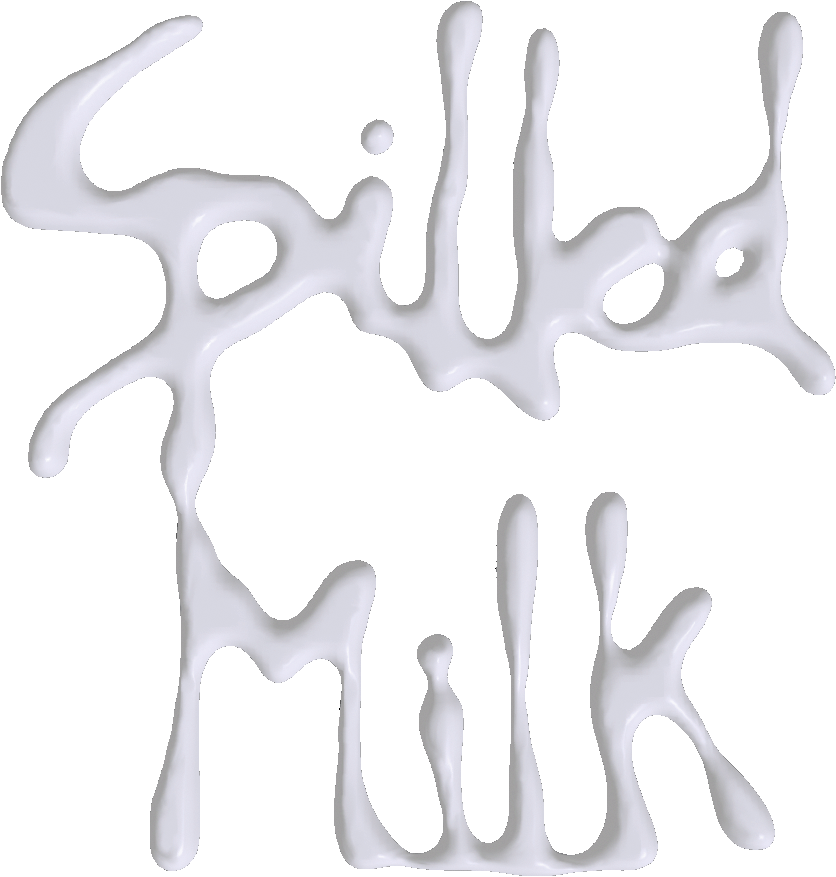
The origin of Spilled Milk® was the result of
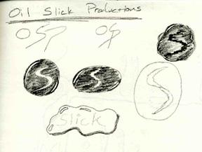
a couple hours of doodling. I started out with the concept of an oil slick. I
liked the rainbow patterns that change with the movement of oil and thought that this
would make a cool animated logo (already thinking of a web-site). The outside of the
logo would be circular and the letters that spelled out the name would float within the
drop of oil. The name "Oil Slick" almost stuck, but I thought the word
"slick" had good and bad connotations. Sometimes you can't go with your
first try, even though it might turn out to be the best one. In this case, it wasn't.
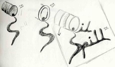
I then drew a barrel of oil spilling/spelling out
the name "Oil Spill", much like the Spilled Milk logo. The oil seemed too
dark on the page and oil spills in general have a very dark feeling about them. You
could see it coming from a mile away that "Oil Spill" was not going to make it.
I liked the way the "Oil Spill" logo
flowed across the page and needed something else that flowed. I thought about ink.
Nope, too dark. Plus, spilling ink and comics don't mix very well. The
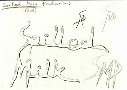
old adage just popped into my head and "Spilled Milk" was born.
The sketch above is a far cry from what was done
next. I drew what was to be the final logo on a huge comic page and then inked it.
I took it to Signal Graphics and they had some trouble scanning it in for me, but
eventually they got me the letterhead and envelopes I wanted. They gave me the scans
on disk and I was able to use them on this web-site before I got a scanner myself.
If you saw the web-site when it first opened you saw a huge logo which took forever to
load (just to see a logo).
I was able to reduce the scan using
Photoshop to create the logo that you see on each page. I took a copy of that and
filled it in with black so all you could see is an silhouette. Then I reversed the
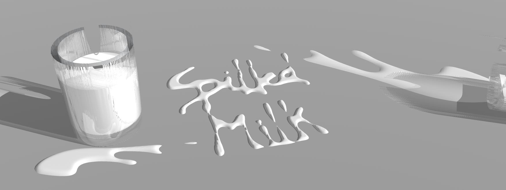
image so it was a white outline on a black background. I brought this 512 x 512
image into Bryce 4.0 and created a symmetric lattice, after applying some rounding in the
editor. The rounding made some of the letters run together, but it looks a little
more realistic that way. The result was a bulky logo so I created a floor (gray) and
pushed the lattice down through the floor until it looked like Spilled Milk.
It seems like there is much crying in the comic
industry with company titles that are crying for the sun to come up and book titles that
tell people not to cry. I figured I'm not crying here, so you just need to hurdle
over the adversity that is thrown your way and use that momentum to keep going forward.
I've gotten great reactions to the name from the
folks at the art supplies shop to Card Secure (now eHost,
B2Bnow.com). People seem to remember it probably
because they can associate it with something they already know. It makes
most people laugh, and then they're stuck with it like a bad tune. The
name should be a good contrast, because the comic should be fairly dark with a
few light moments to bring the reader up for air once in a while.
 Spilled Milk Comics
